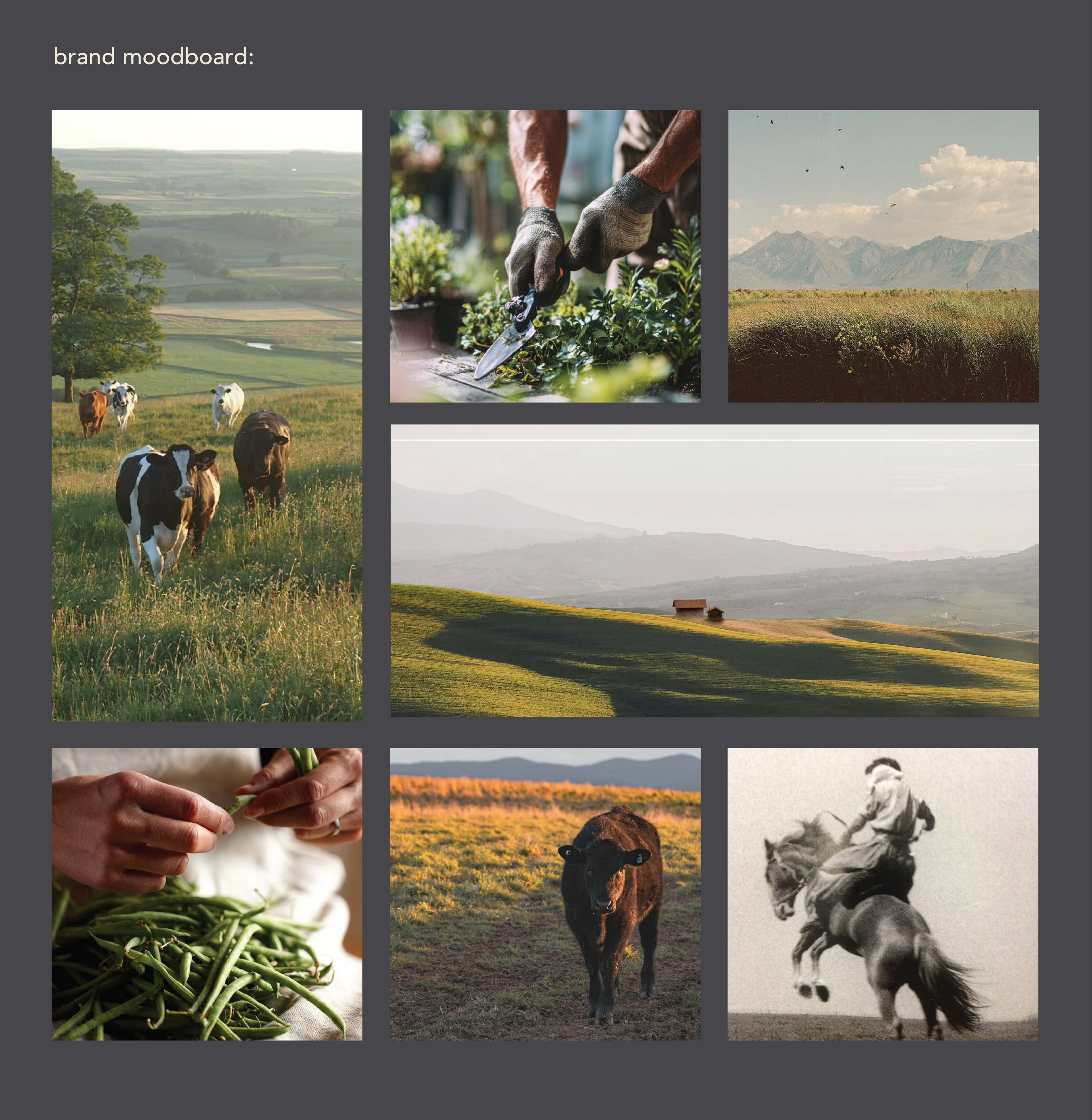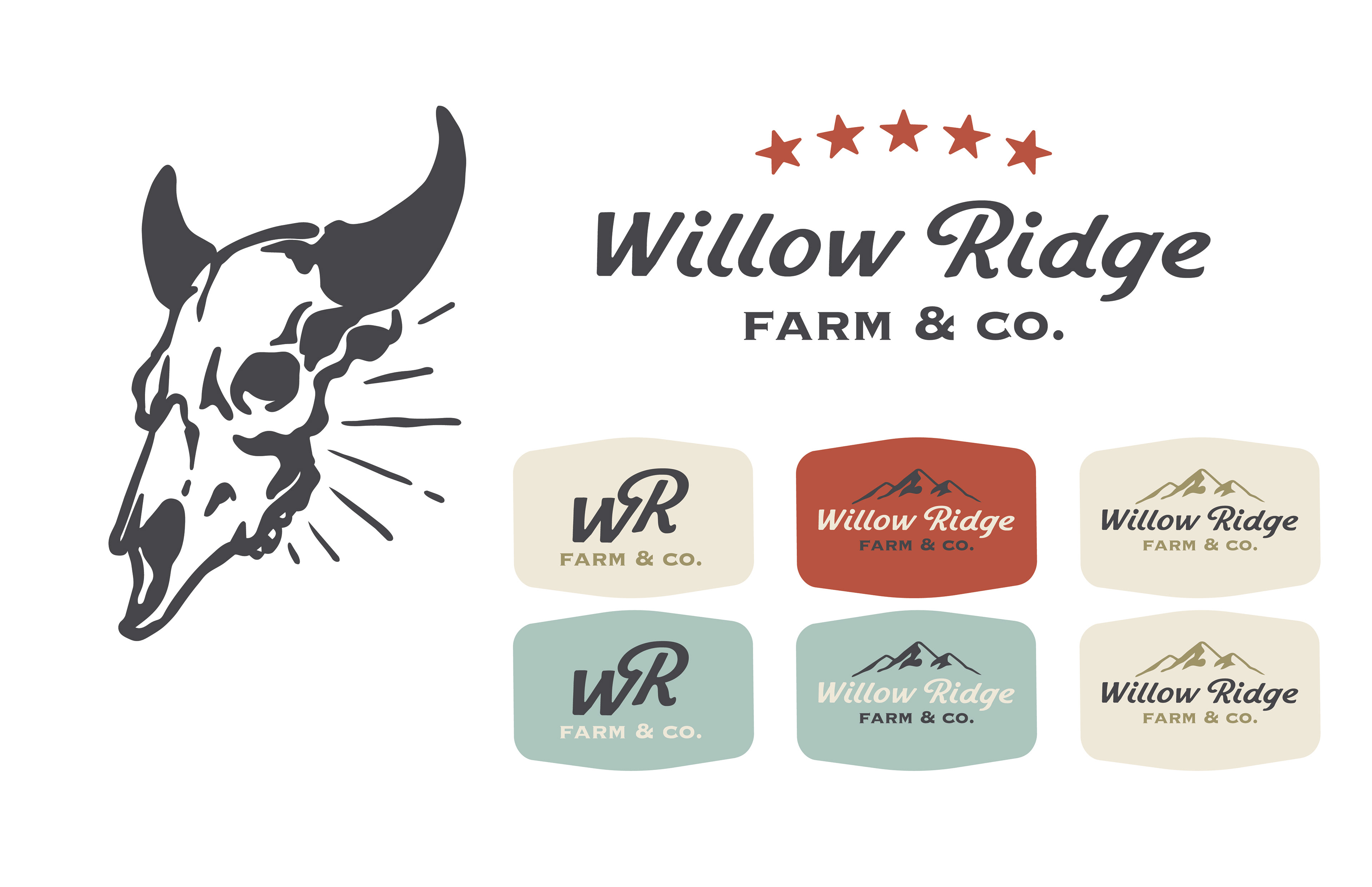
I was challenged to develop a cohesive brand identity for a modern farm located in Northern Kentucky. Willow Ridge is a small family-oriented farm that was looking for branding that highlights the authentic American voice that can live in modern times. The concept centers on balancing tradition with a contemporary agricultural perspective, reflecting both the heritage of the land and the evolving nature of farming today.
・・BRAND GUIDELINES・・
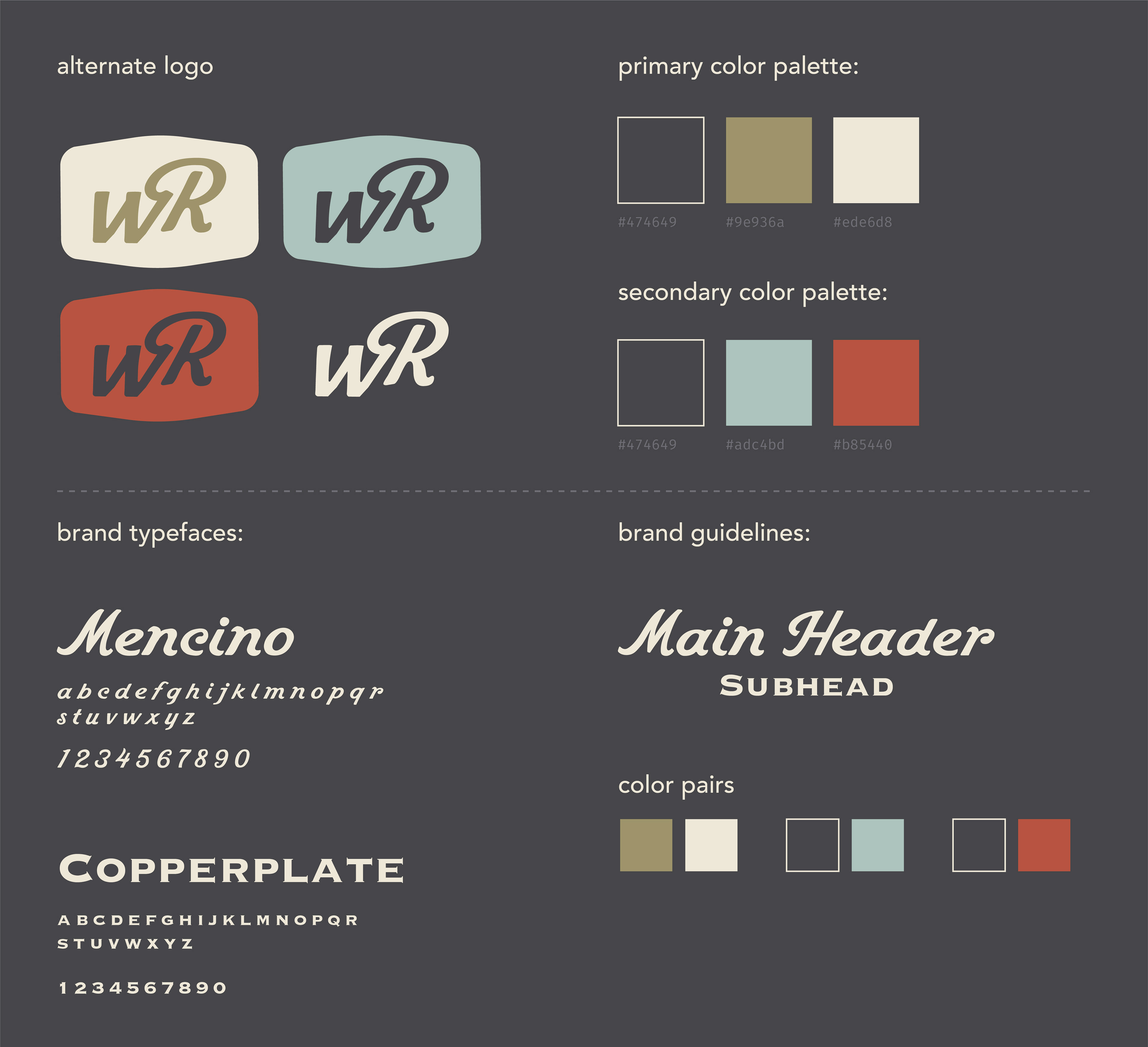
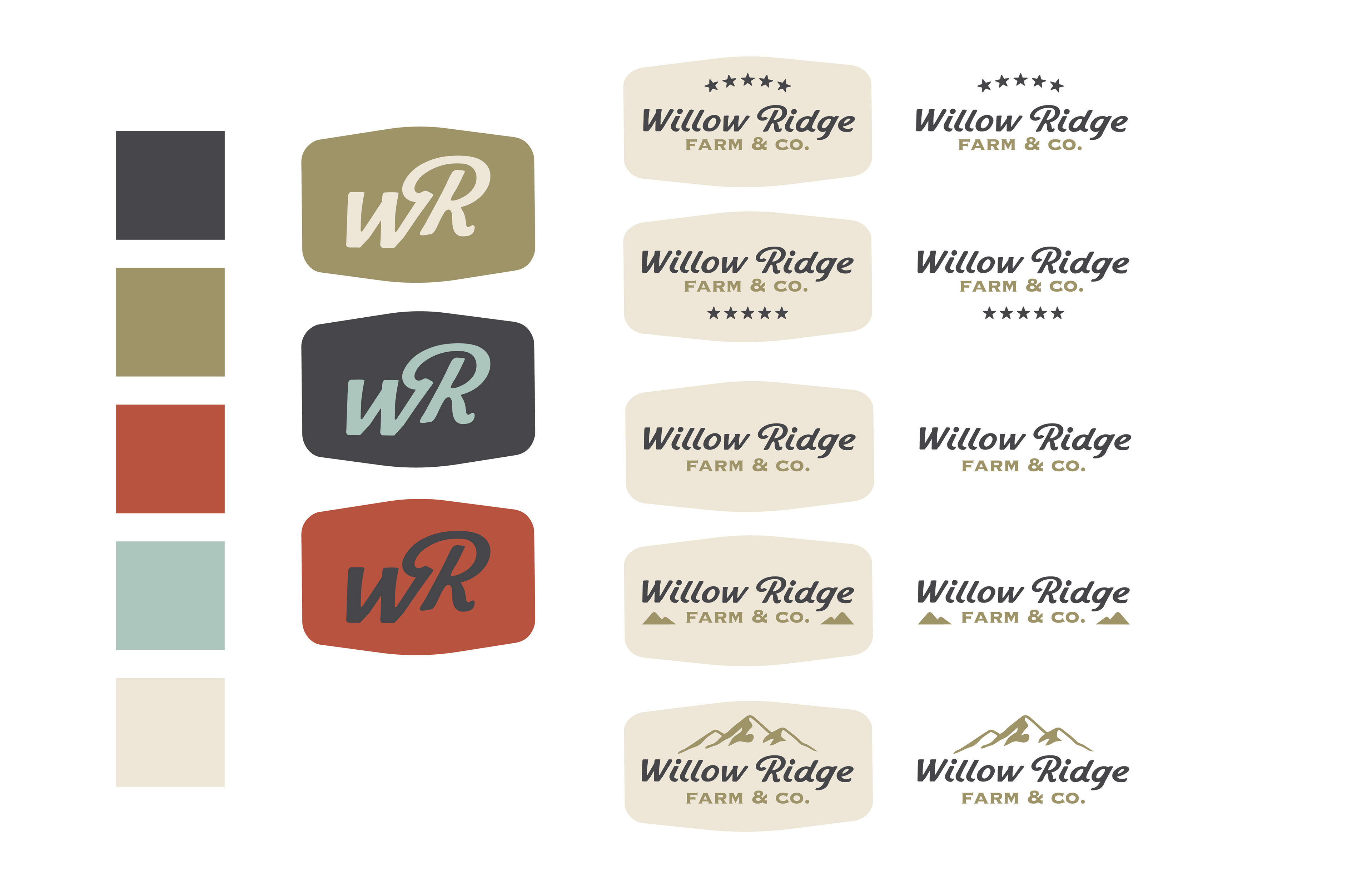
The visual identity draws from natural forms and rural iconography, refined through a modern lens. Organic shapes and clean typography work together to create a system that feels both grounded and intentional. The color palette is inspired by the landscape itself, muted greens, warm earth tones, and soft neutrals, chosen to evoke a sense of authenticity and connection to the land.
・・PROPOSED MERCHANDISE・・
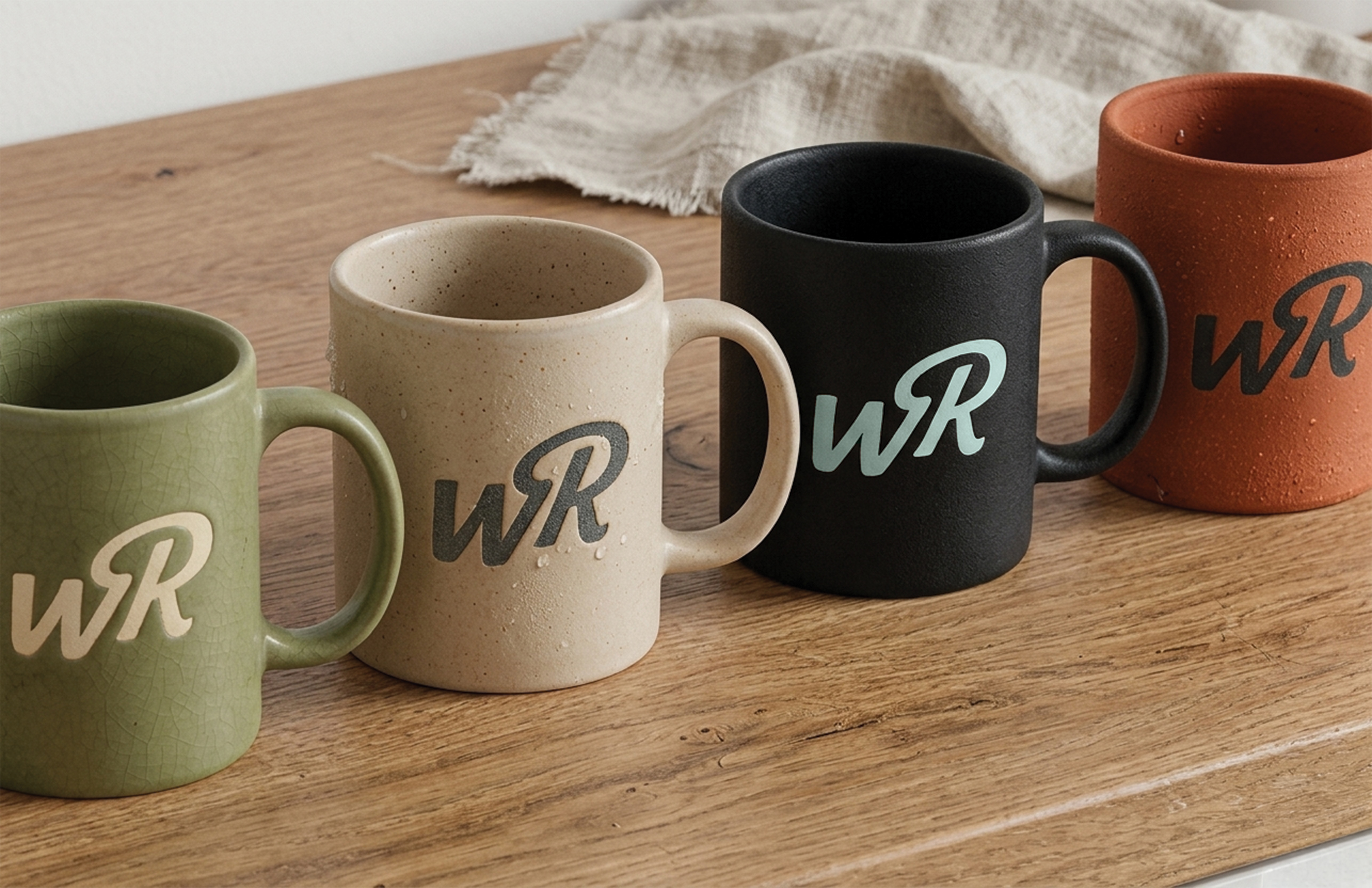

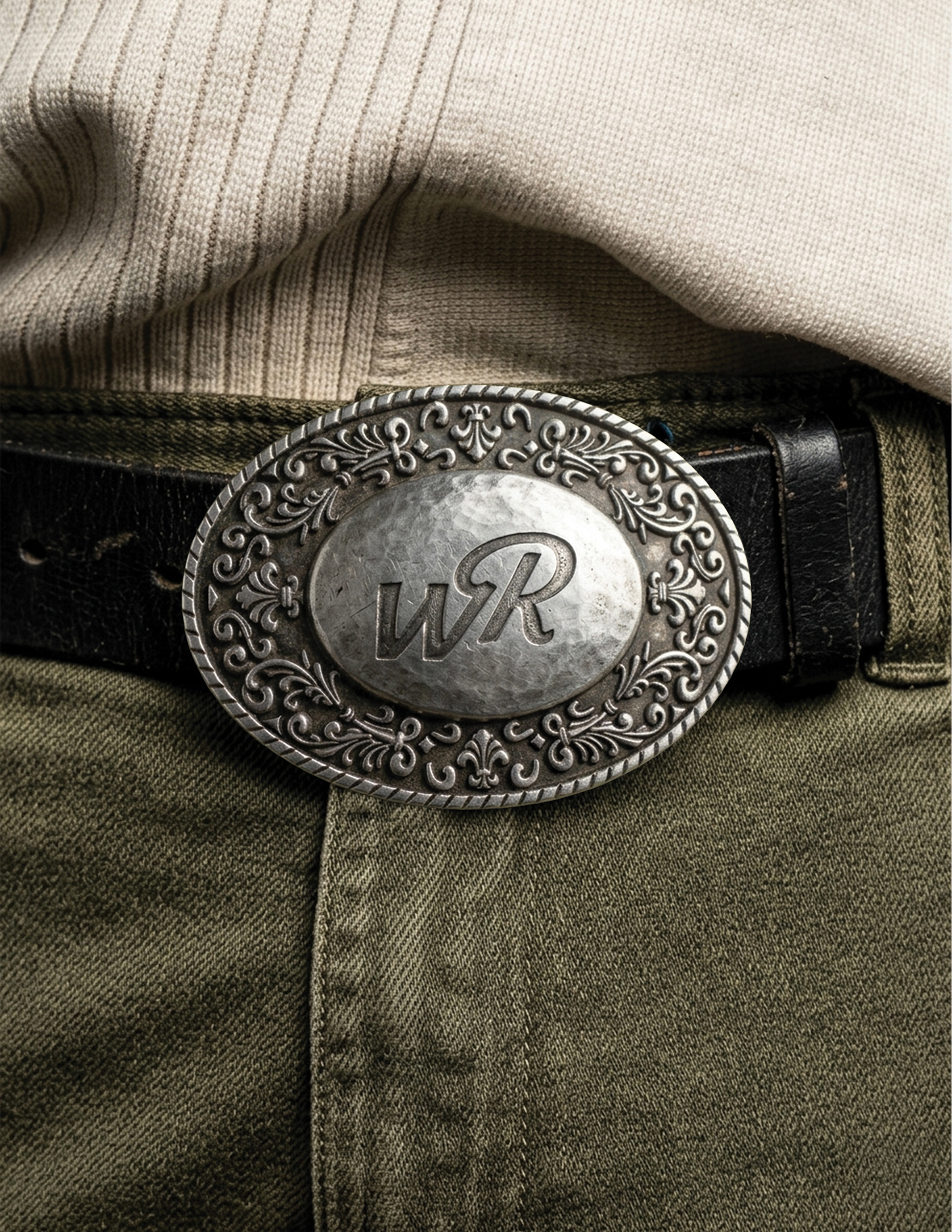
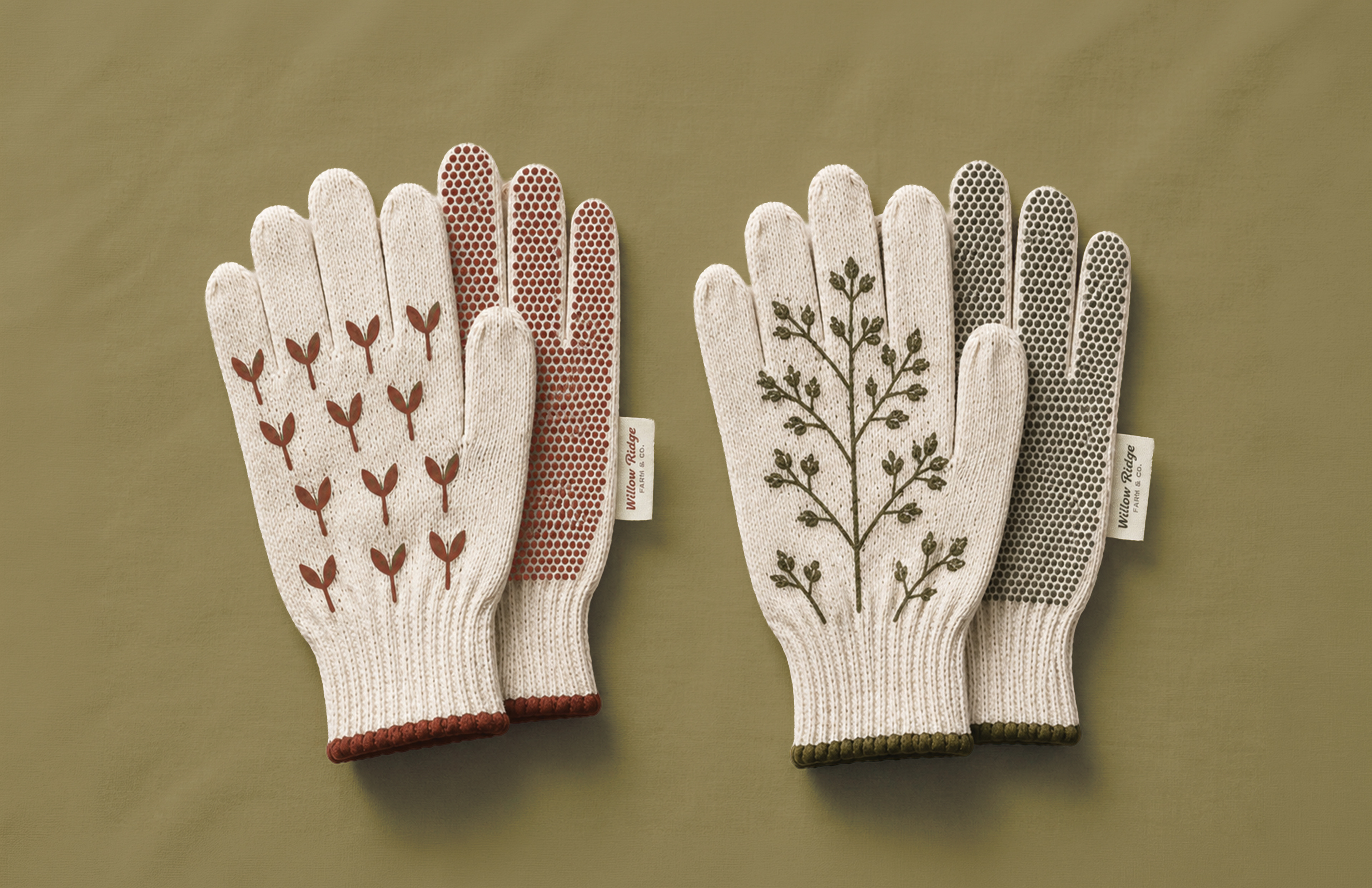
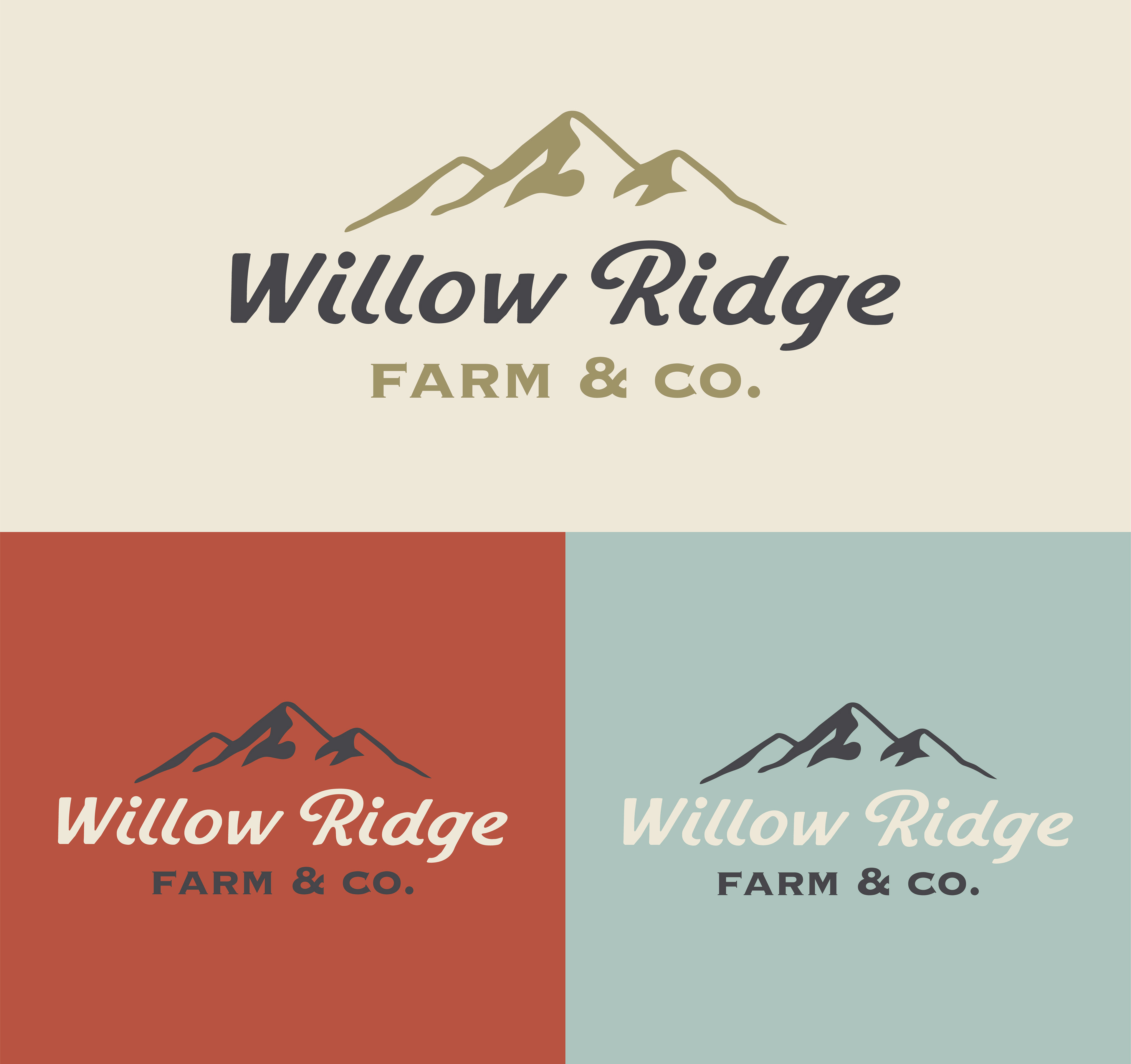
The final identity system balances heritage and modernity, using thoughtful design decisions to communicate quality and pride in the work. Willow Ridge is positioned as a contemporary farm brand that honors its roots while embracing a forward-thinking approach, creating a visual language that is both enduring and approachable. For more information on Willow Ridge, reach out to willowridgefarmllc2025@gmail.com.
・・PROCESS WORK・・