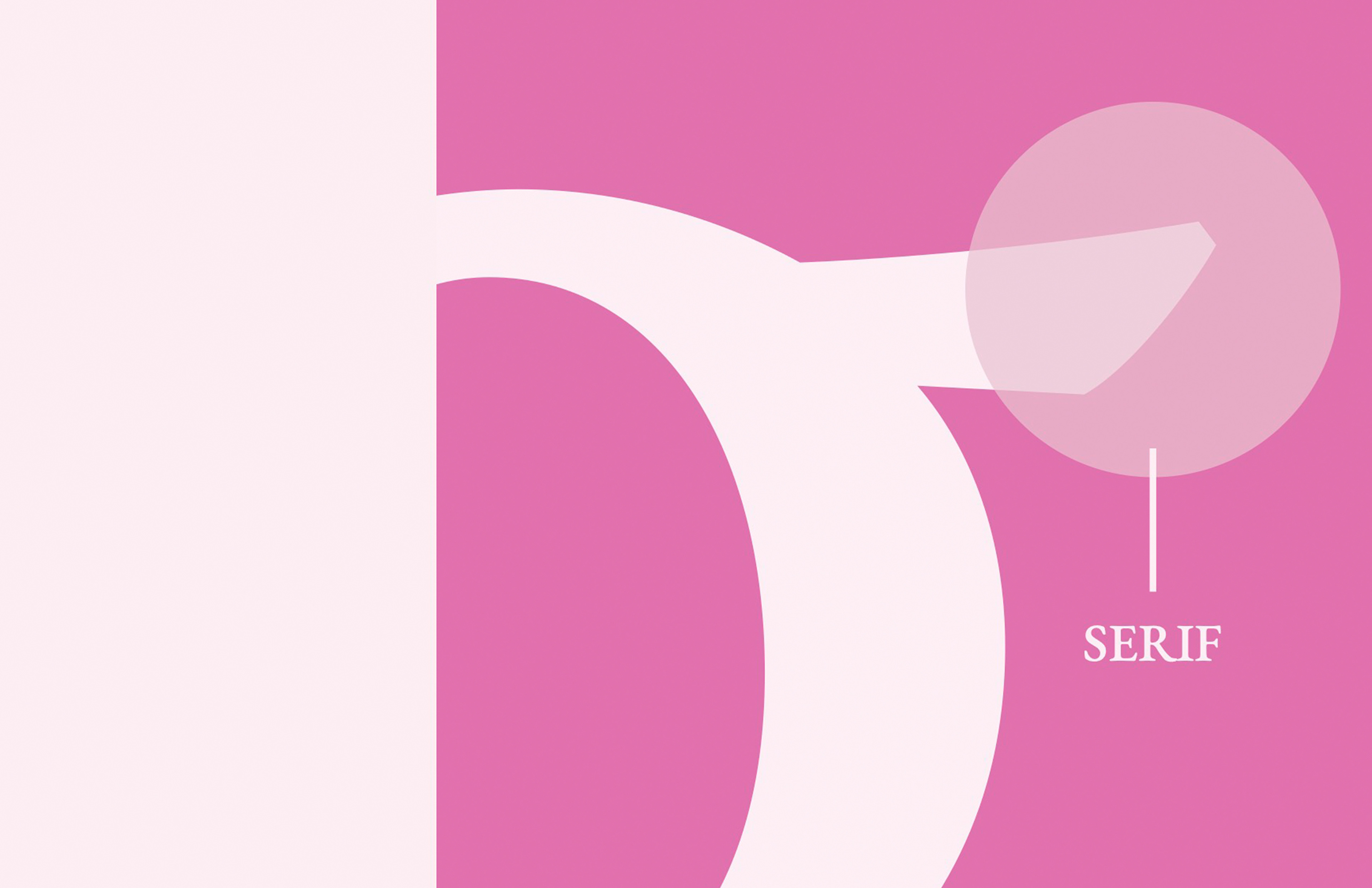


I was challenged to highlight the anatomical characteristics of the Garamond typeface. I focused on understanding the subtle details that define its personality, and worked to present these features clearly and engagingly. The process allowed me to study Garamond on a deeper level and showcase what makes this historic typeface both timeless and uniquely expressive.
Combining Garamond’s delicate serifs with bold, bright visuals creates a clear contrast. This concept reframes the idea that Garamond is a purely traditional typeface, and in turn transforms it into one that can exist in contemporary spaces. While the strong color and shape work to bring attention to the piece, they also serve as a visual metaphor of innovation vs. tradition. Circles, triangles, and overlapping shapes were incorporated as a means to disrupt the rigidity of the traditional typographic presentation. Through the interplay of visual forms, the design achieves rhythm and movement.
The final product illustrates a design that is both legible and visually interesting by presenting Garamond in a way that acknowledges its historic roots while presenting it in a more contemporary format. The bright colors, bold shapes, and dynamic layout show off the versatility of the typeface while keeping the work relevant to today's audiences.