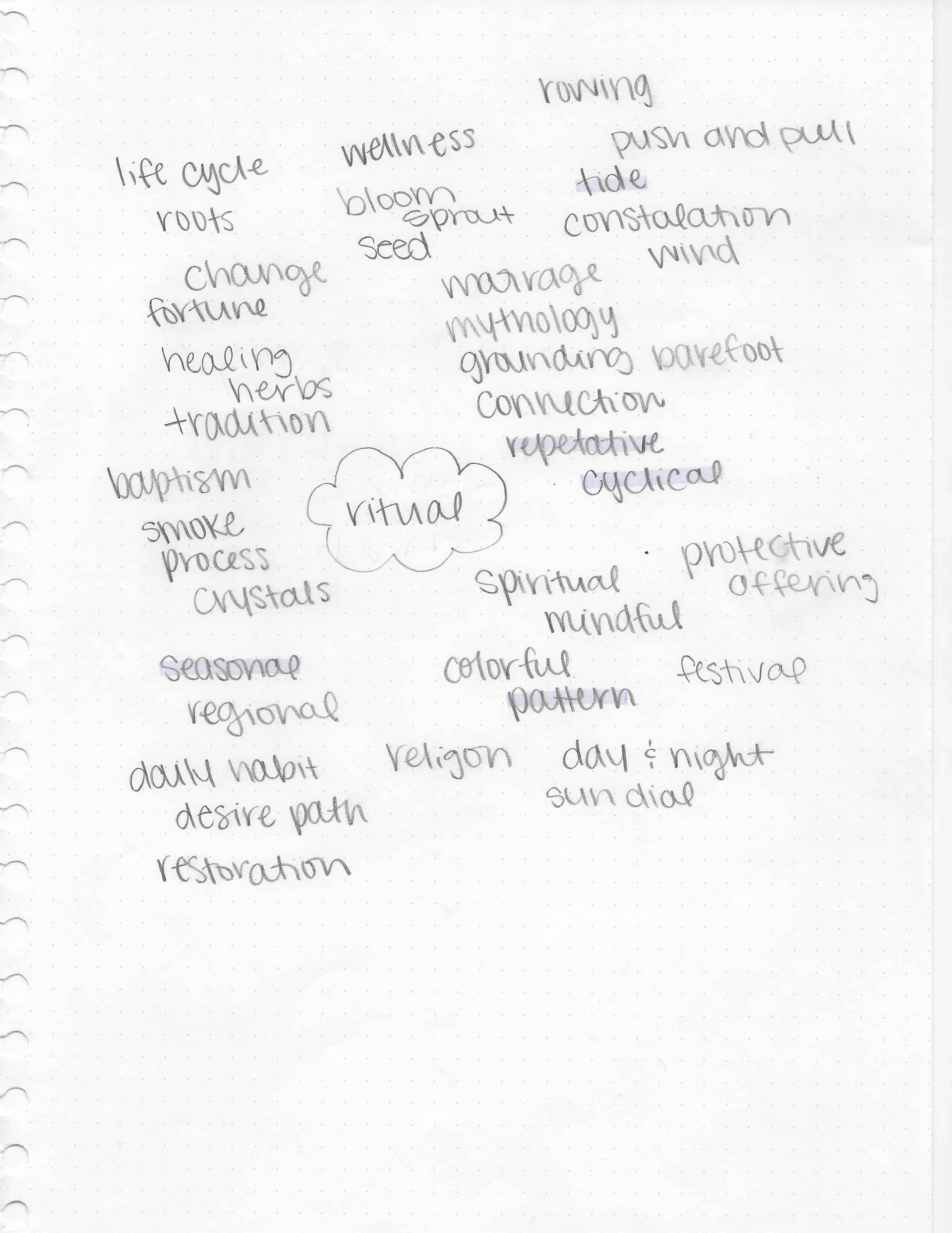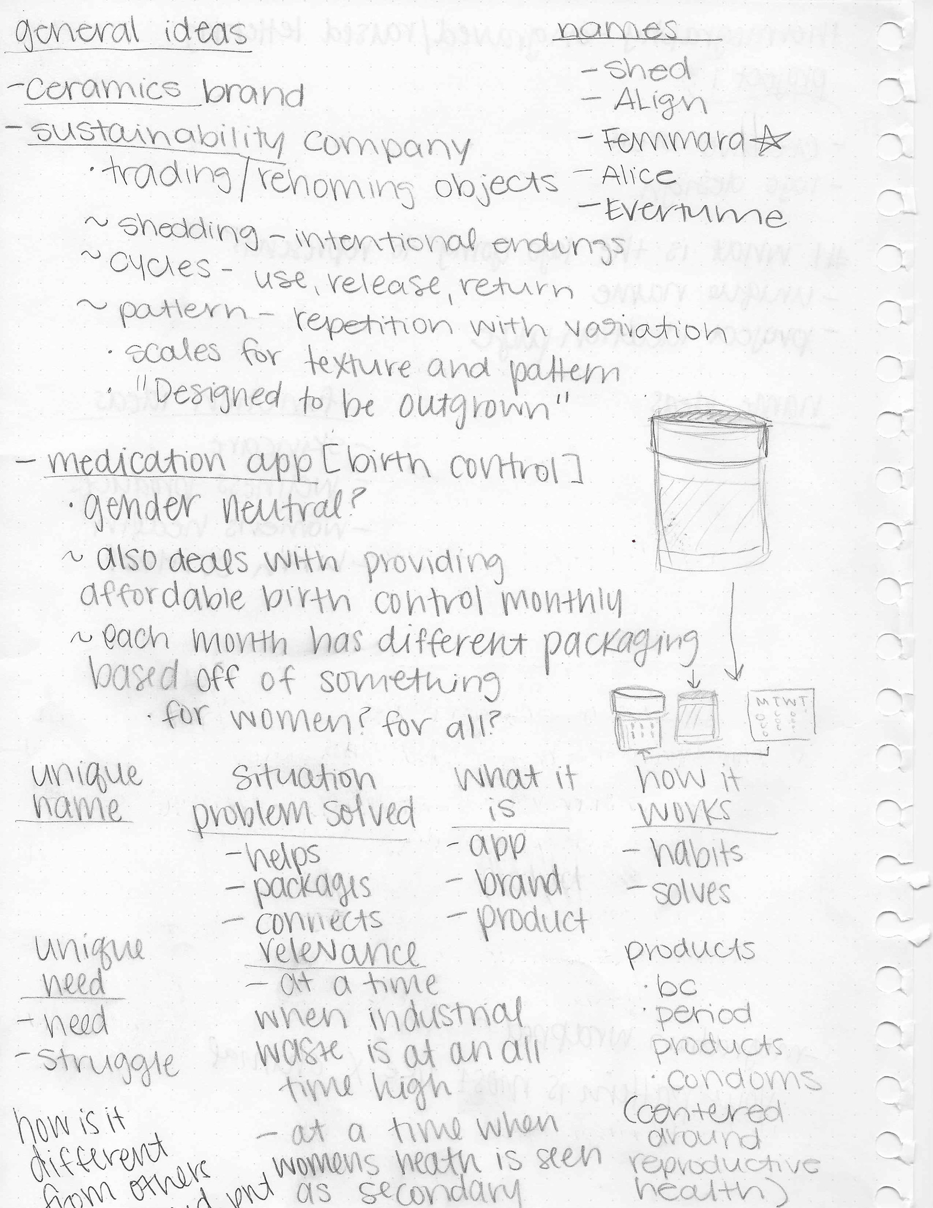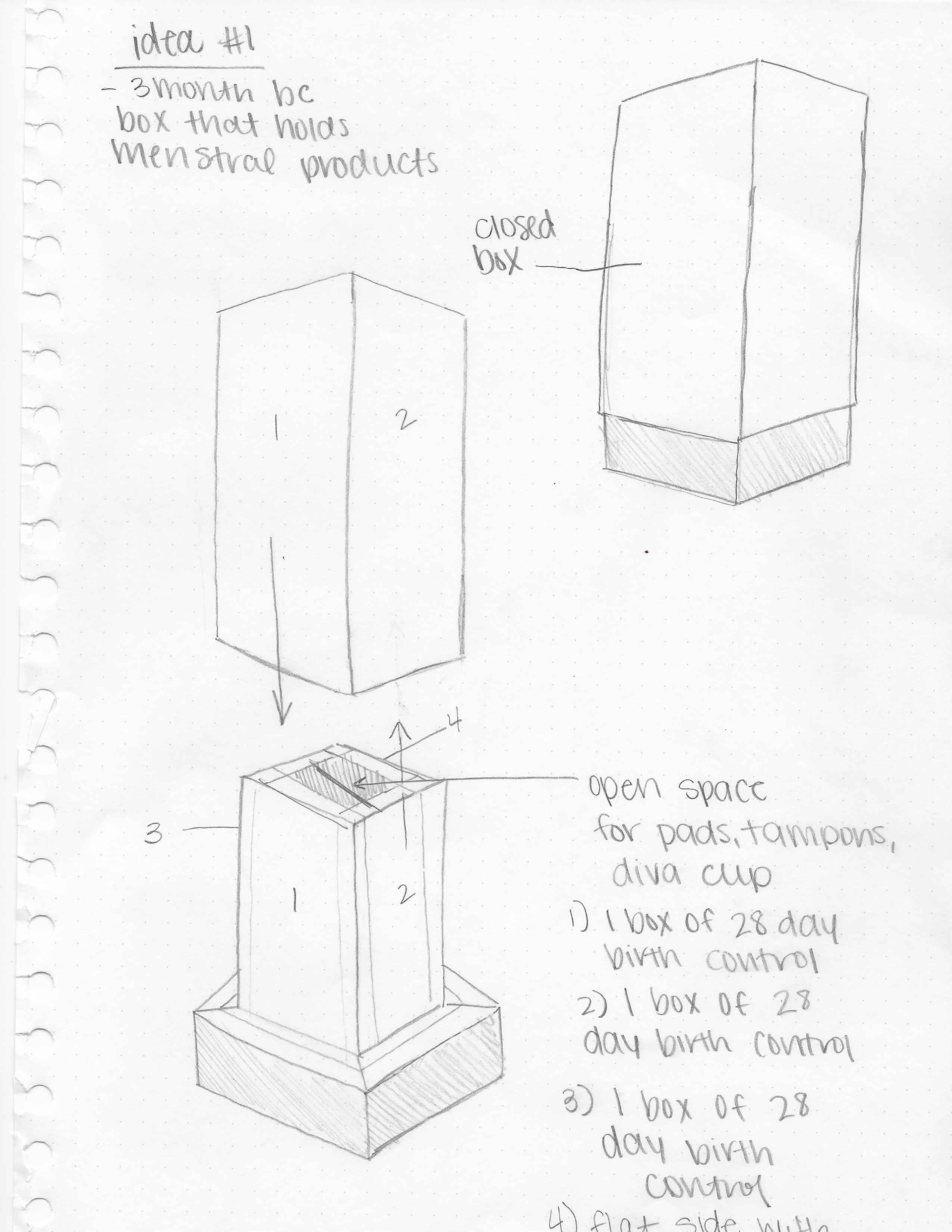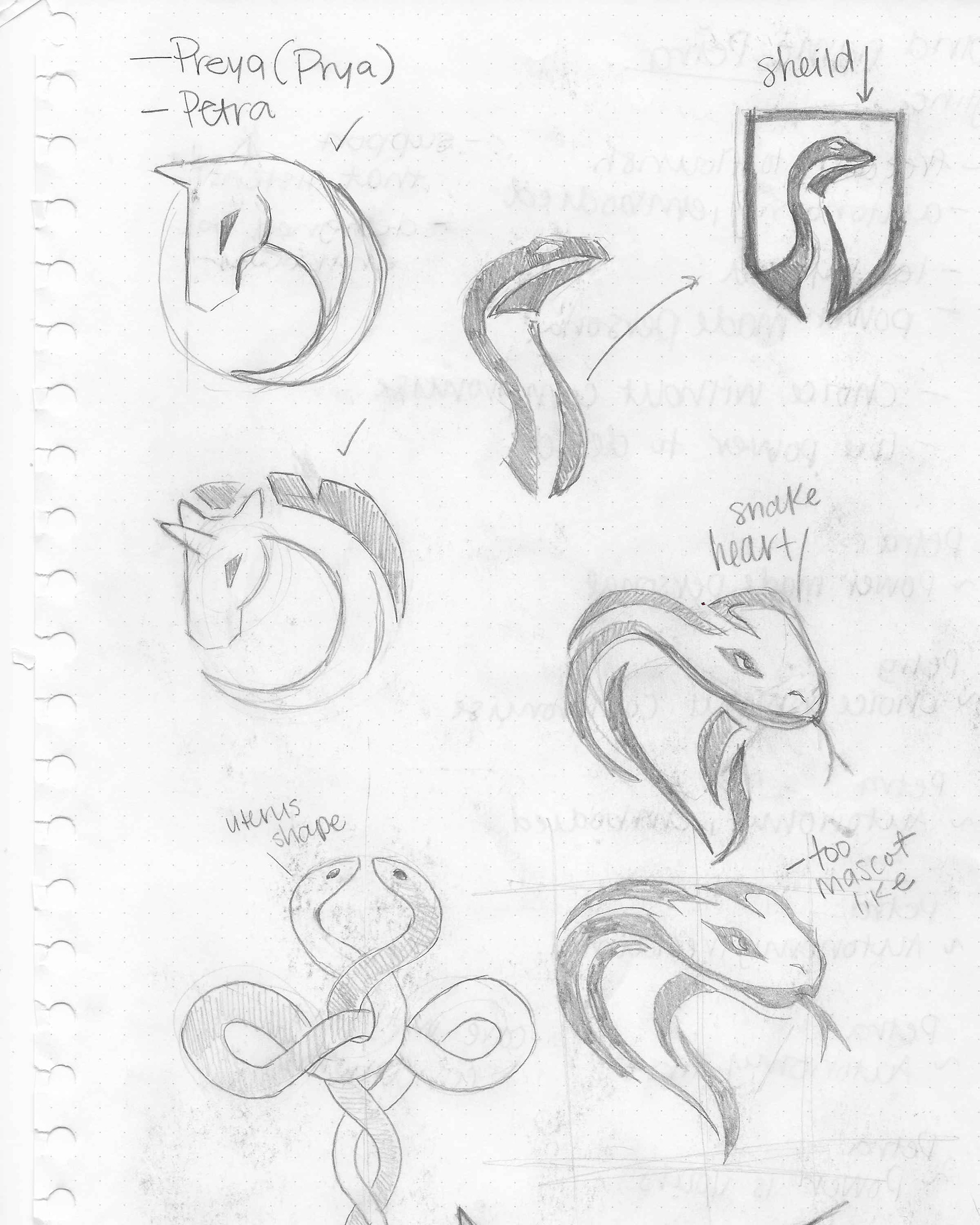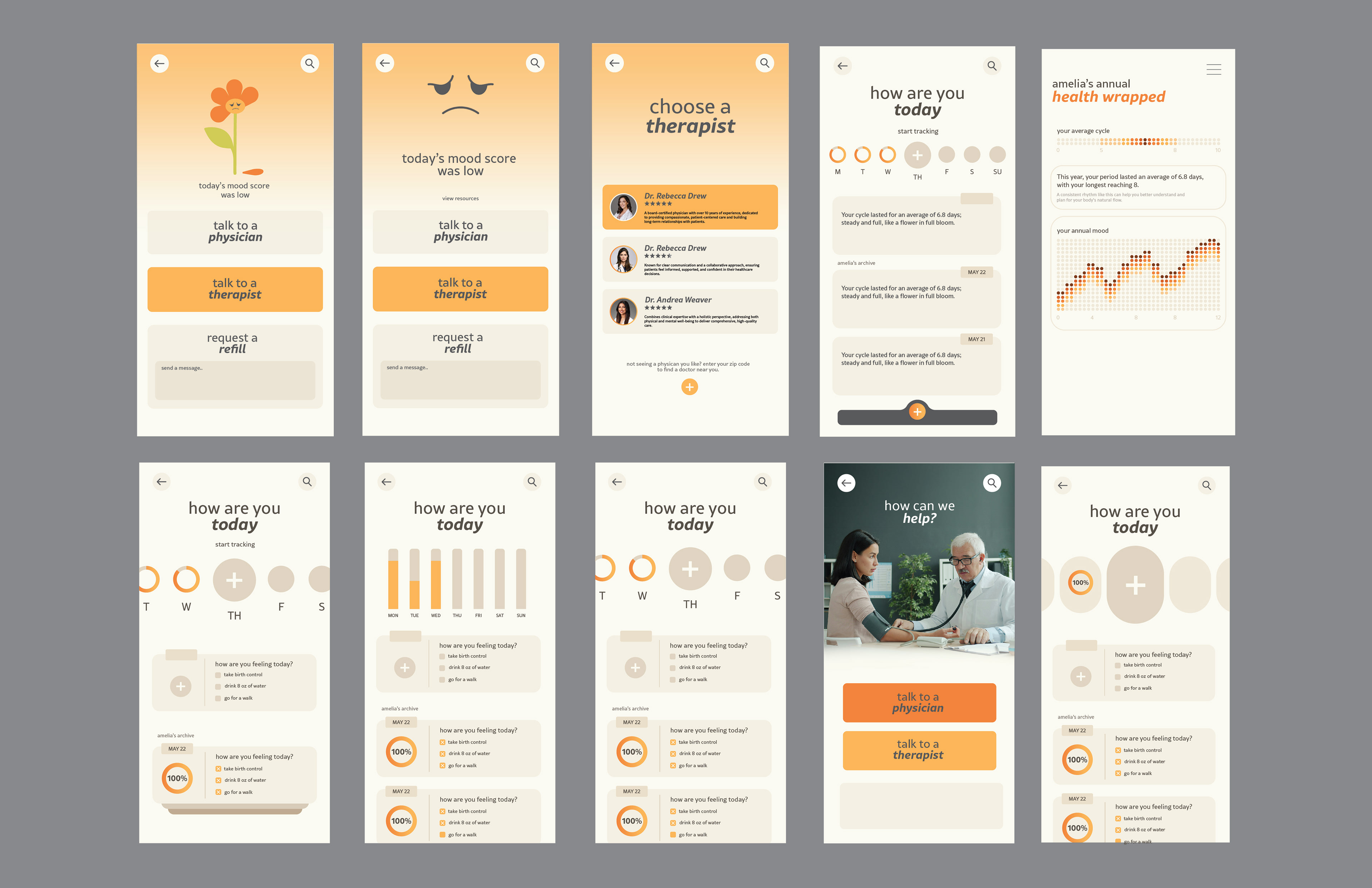
I was challenged to design a cohesive digital and physical experience based on the word ritual. Looking into the meaning of the word, I came to the conclusion that my brand needed to revolve around daily habits. I chose to develop this concept into a solution that supports women’s health and wellness, centering the daily ritual of birth control as a moment of care and consistency. Nectar is an app and companion product designed to empower users through thoughtful, intentional design.
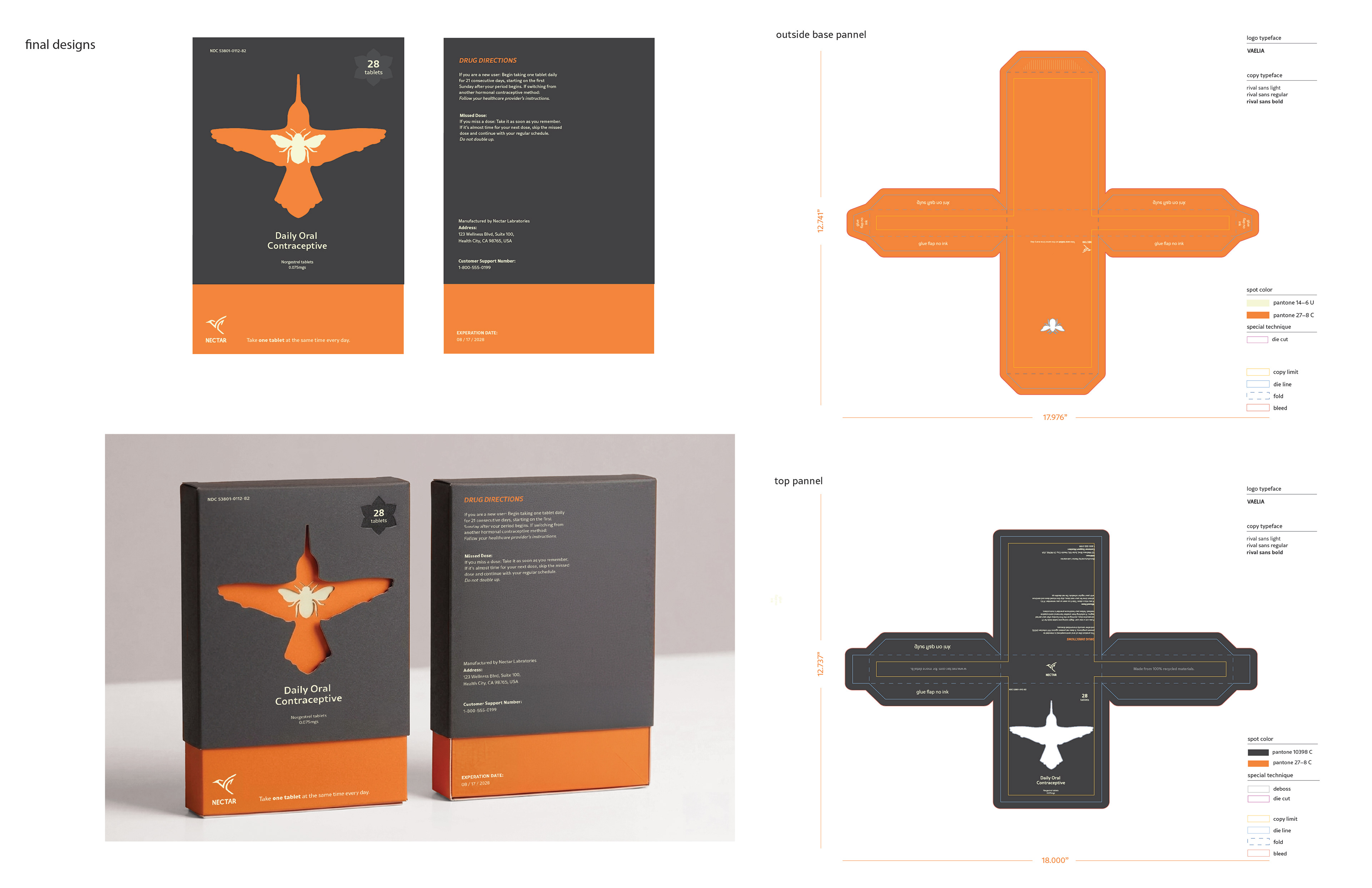
・・PACKAGE DESING・・
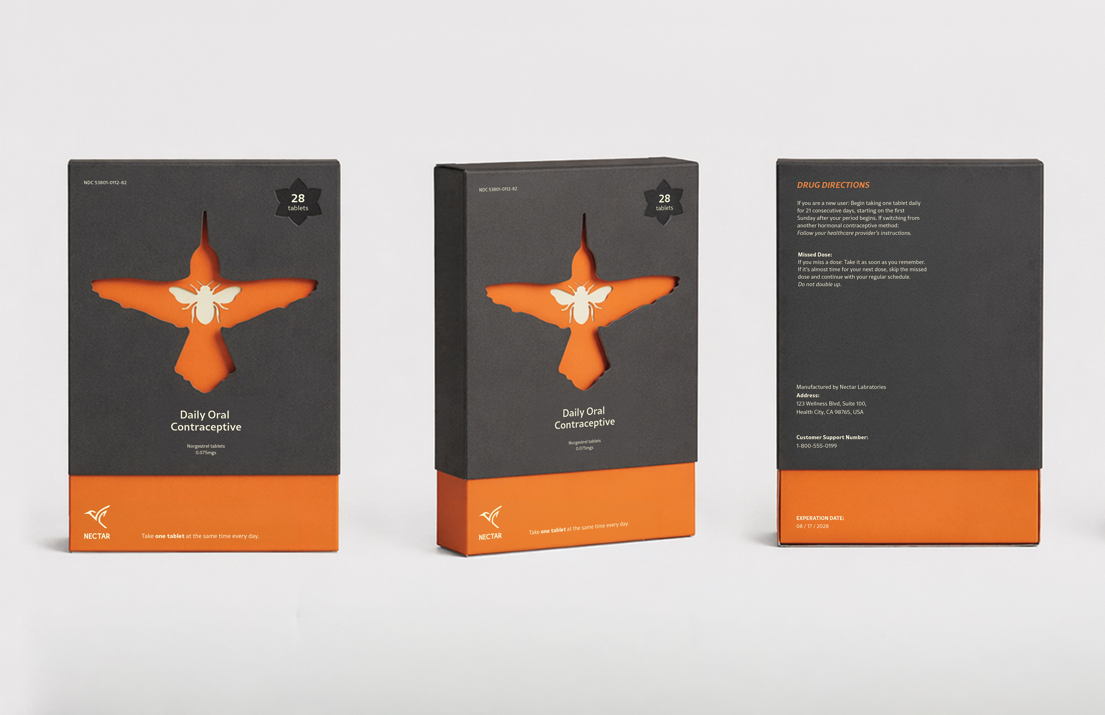
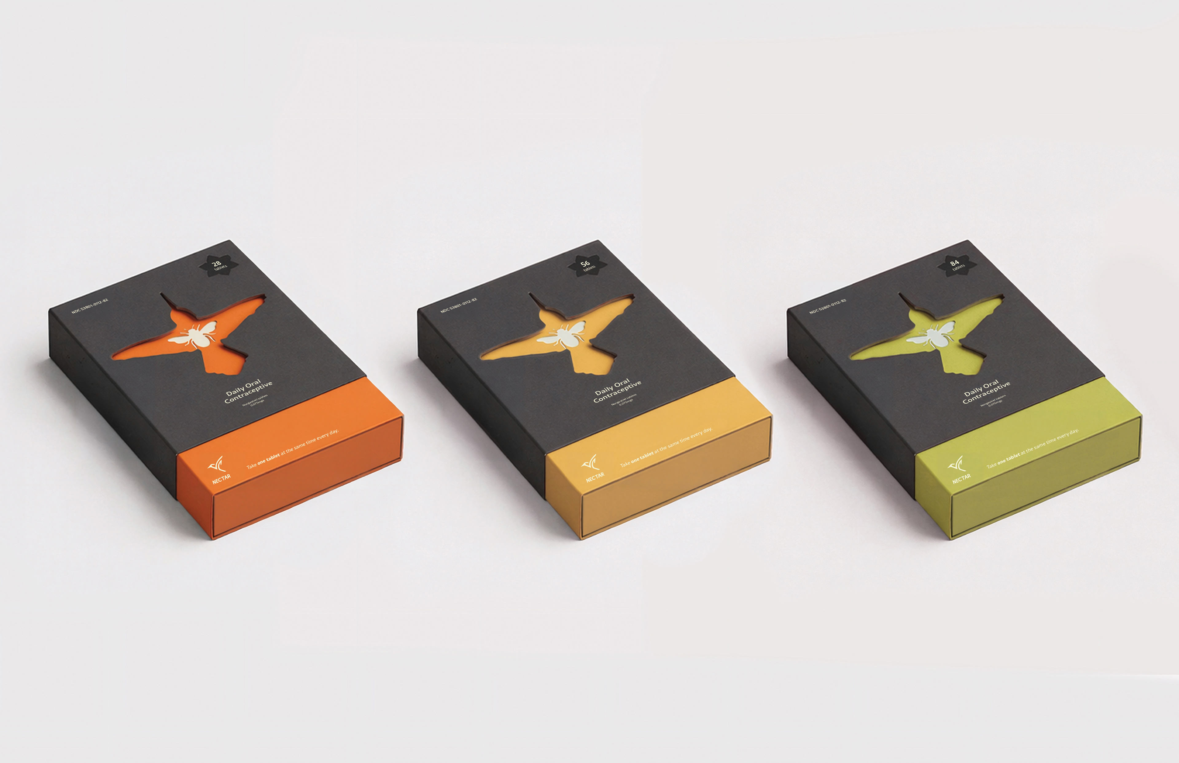
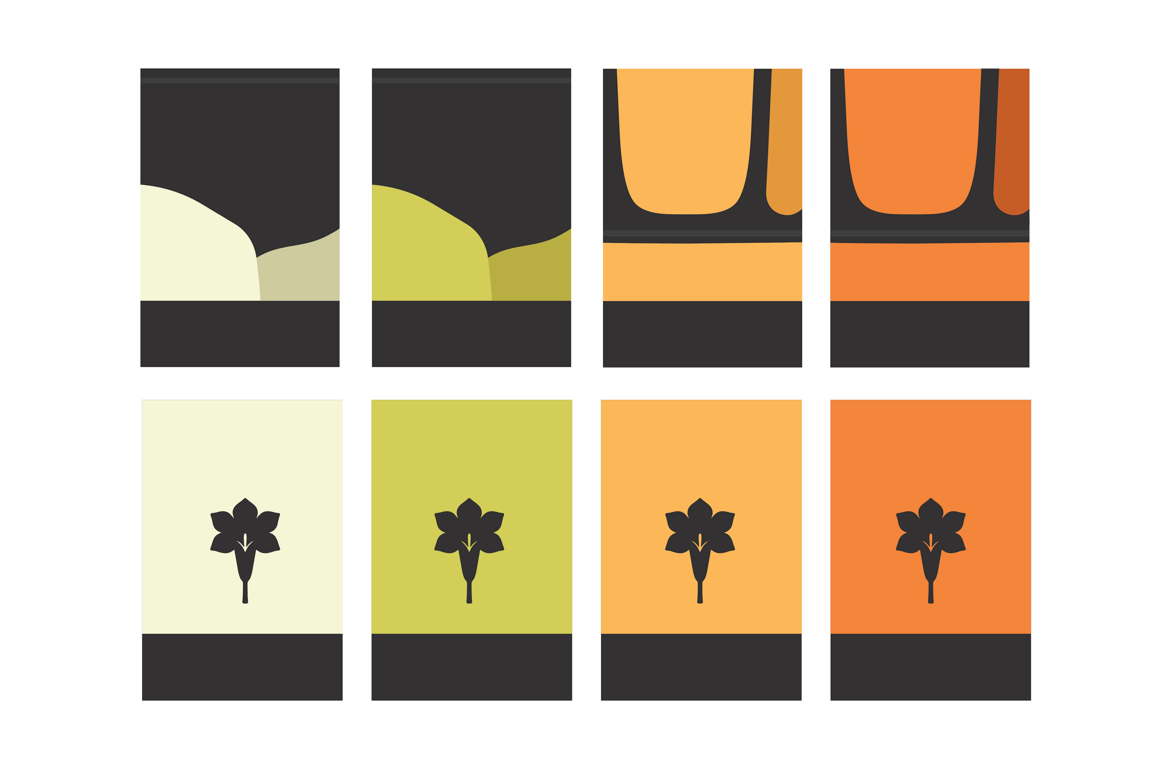
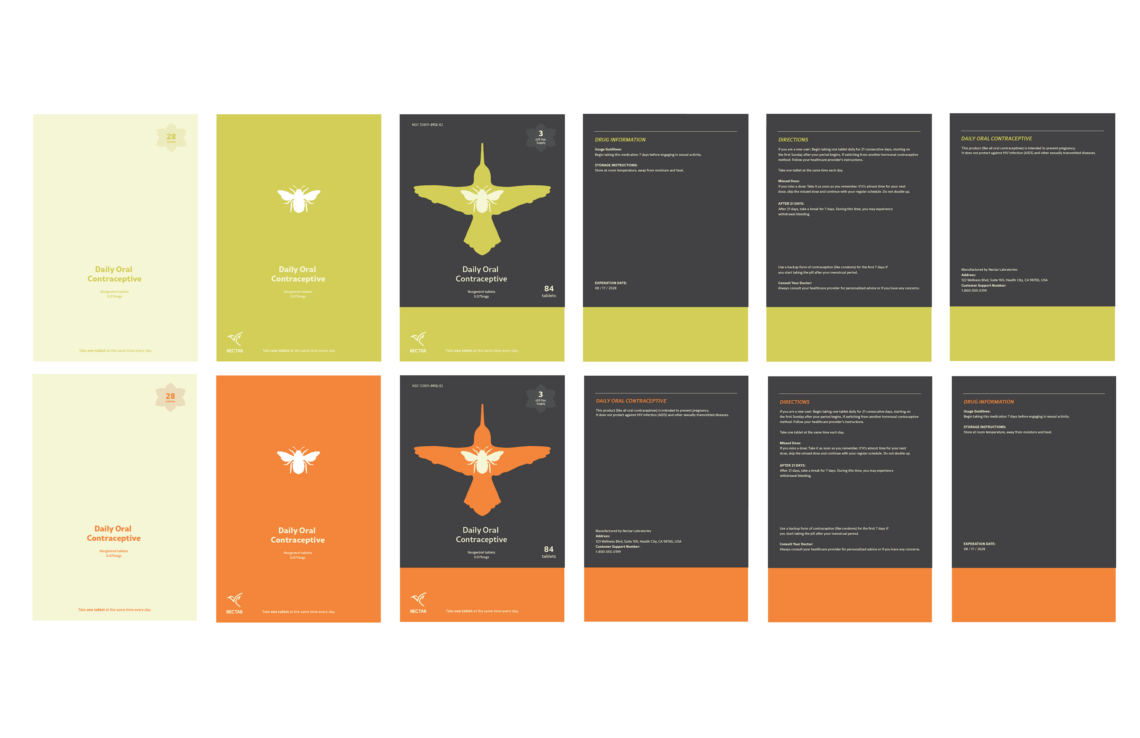
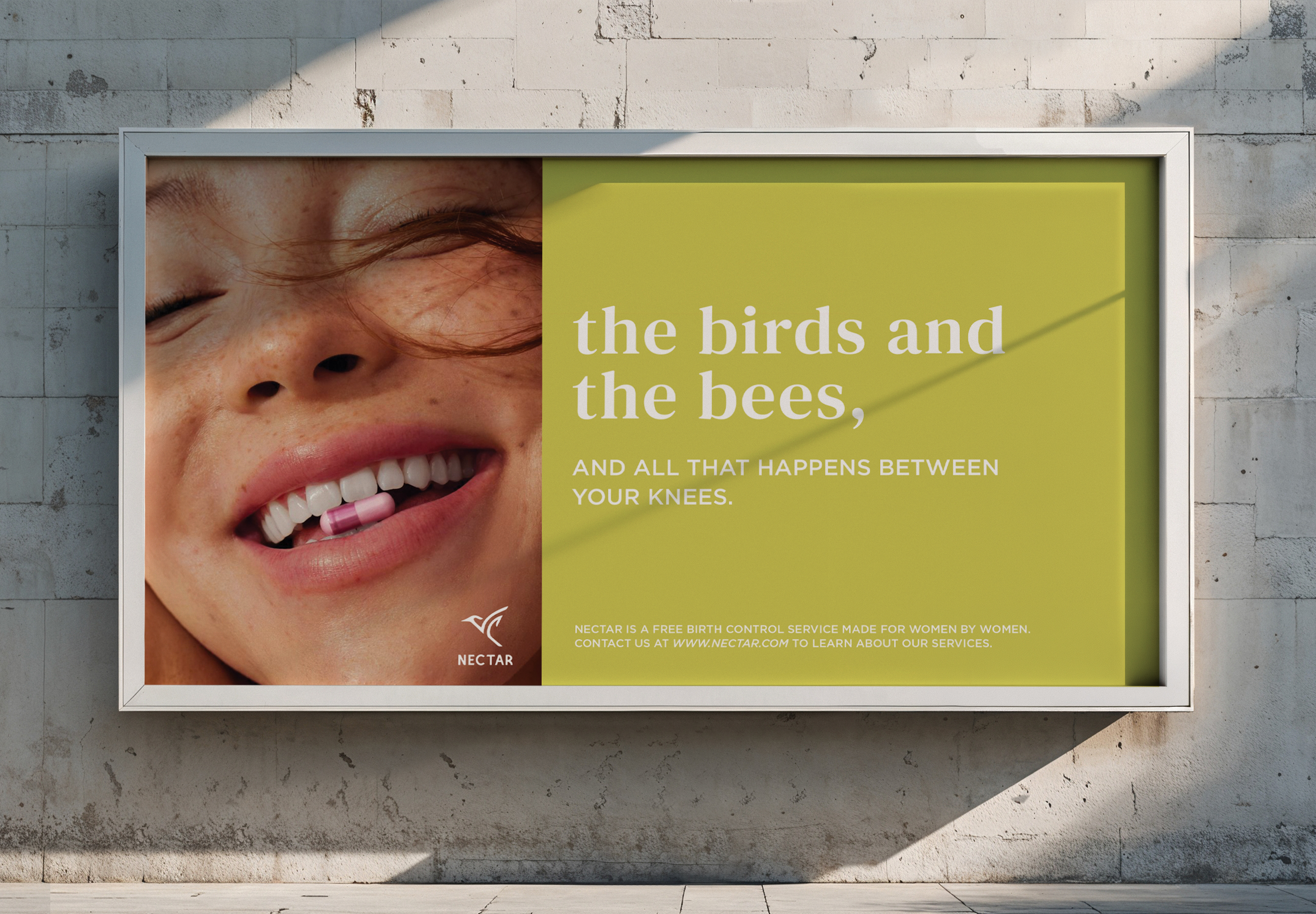
The visual identity balances softness and clarity to reflect both empathy and functionality. A warm, nature-inspired color palette paired with clean typography creates a system that feels approachable without sacrificing usability. The central concept of the package design is rooted in its die-cut construction. When separated, the hummingbird and honeybee reinforce the brand’s natural voice, and when assembled, they come together to form a playful “birds and the bees” visual, which introduces a punchy, witty tone that carries through into the advertising.
・・DIGITAL APP DEVELOPMENT・・
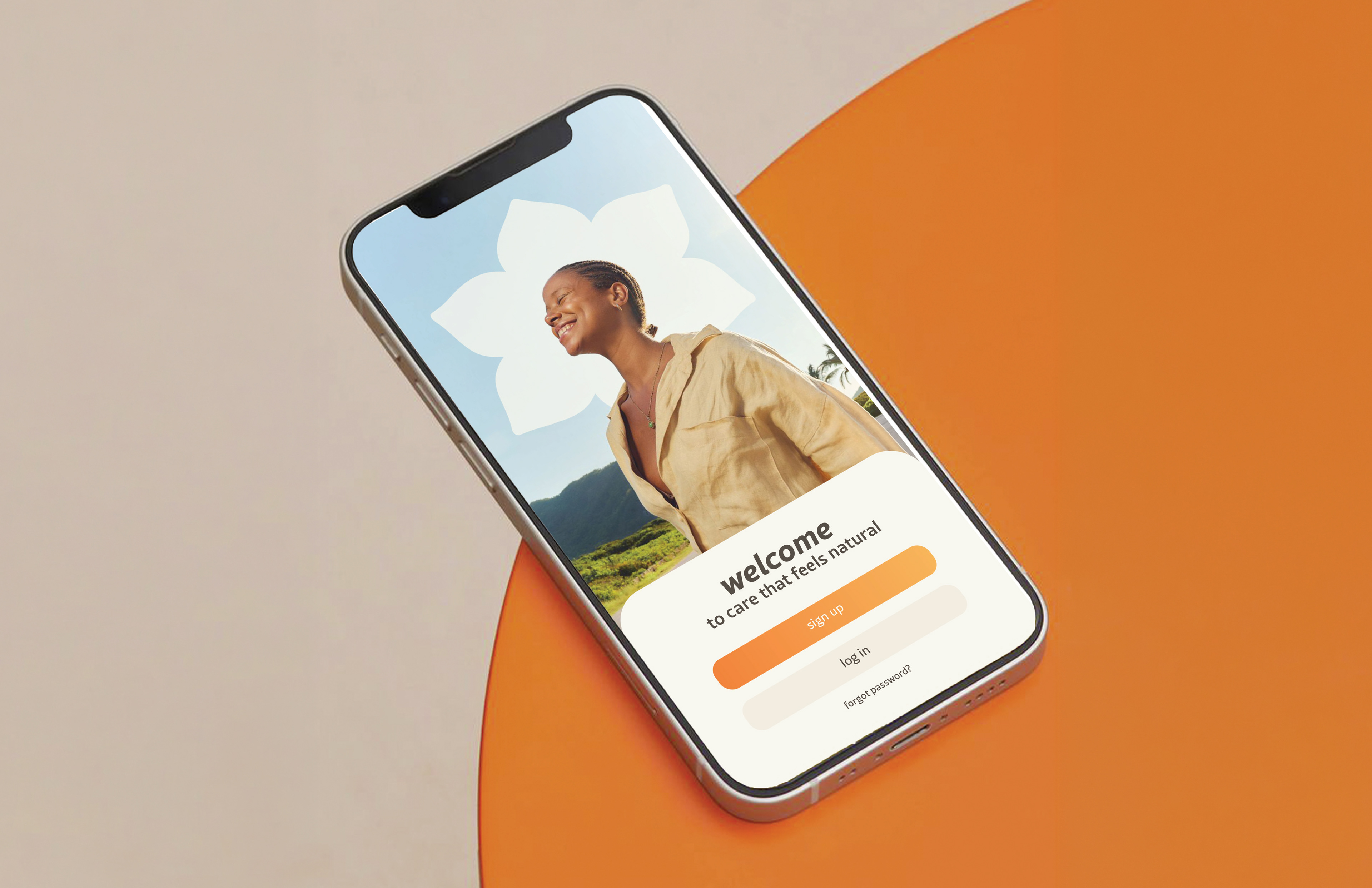
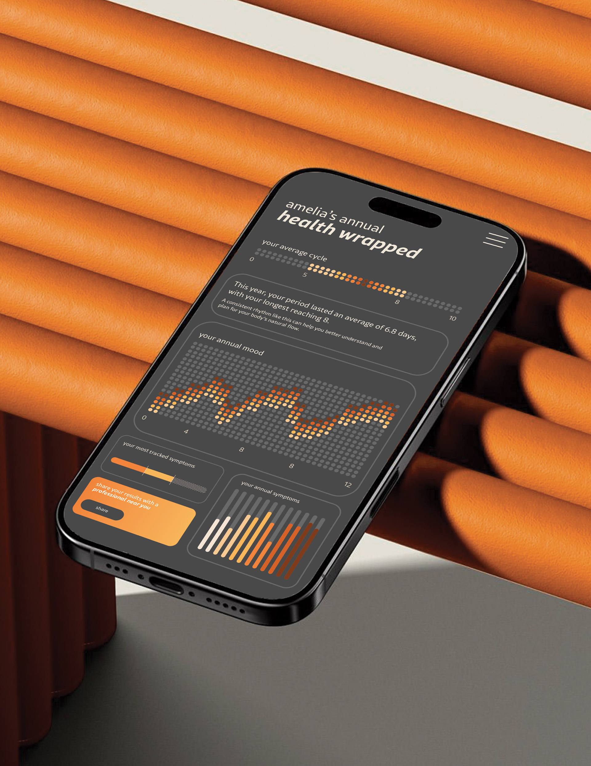
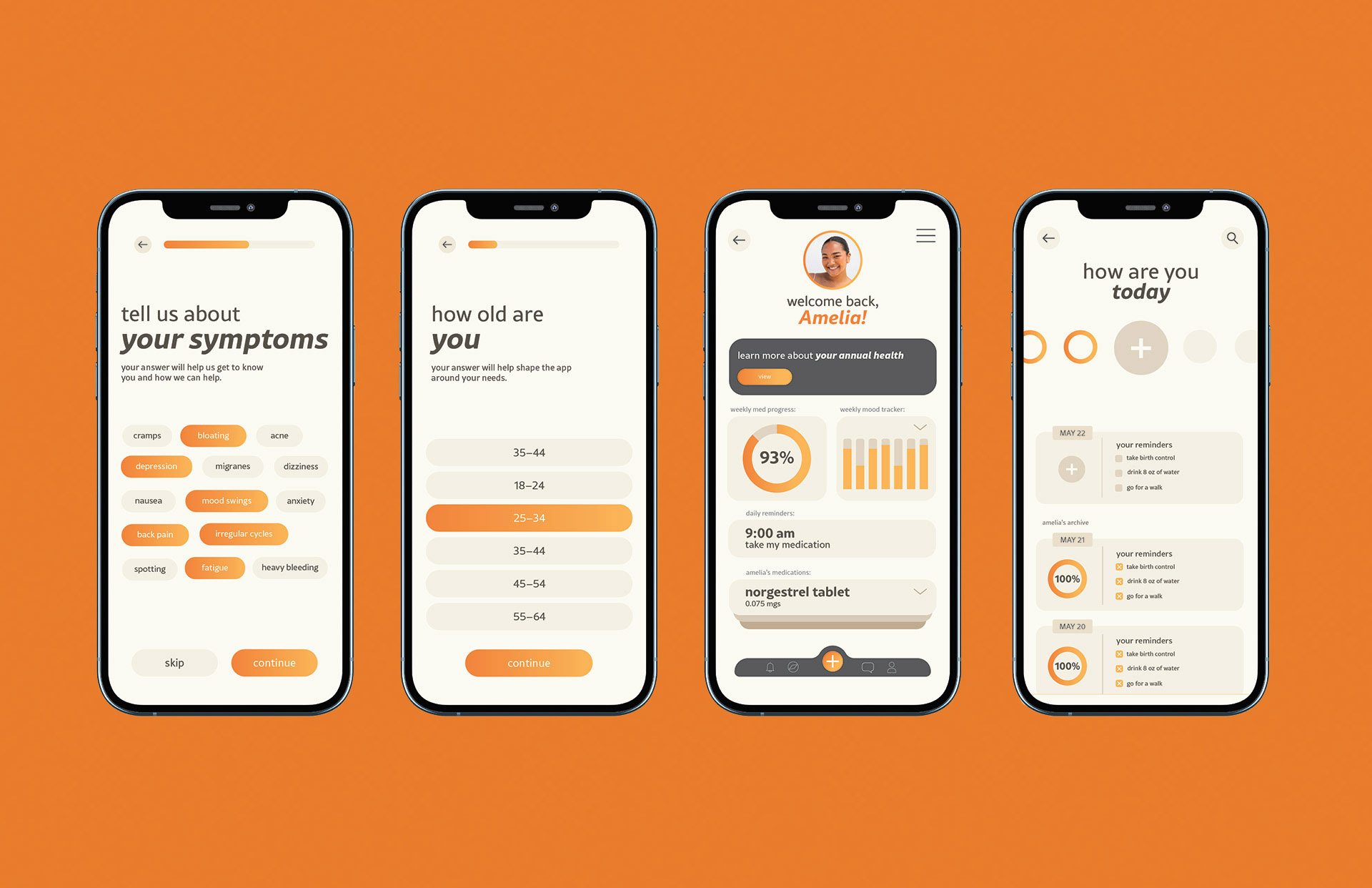
Throughout the design, emphasis was placed on creating a sense of trust and inclusivity. Data is presented in a way that feels personal and engaging rather than clinical, allowing users to engage with their health in an intuitive and empowering way. Every element, from interface to packaging, was designed to reduce stigma, encourage consistency, and celebrate the individuality of each user’s experience.
The final design balances emotional connection with practical function, creating a holistic system that supports women not only in tracking their health but in building a deeper understanding of it.
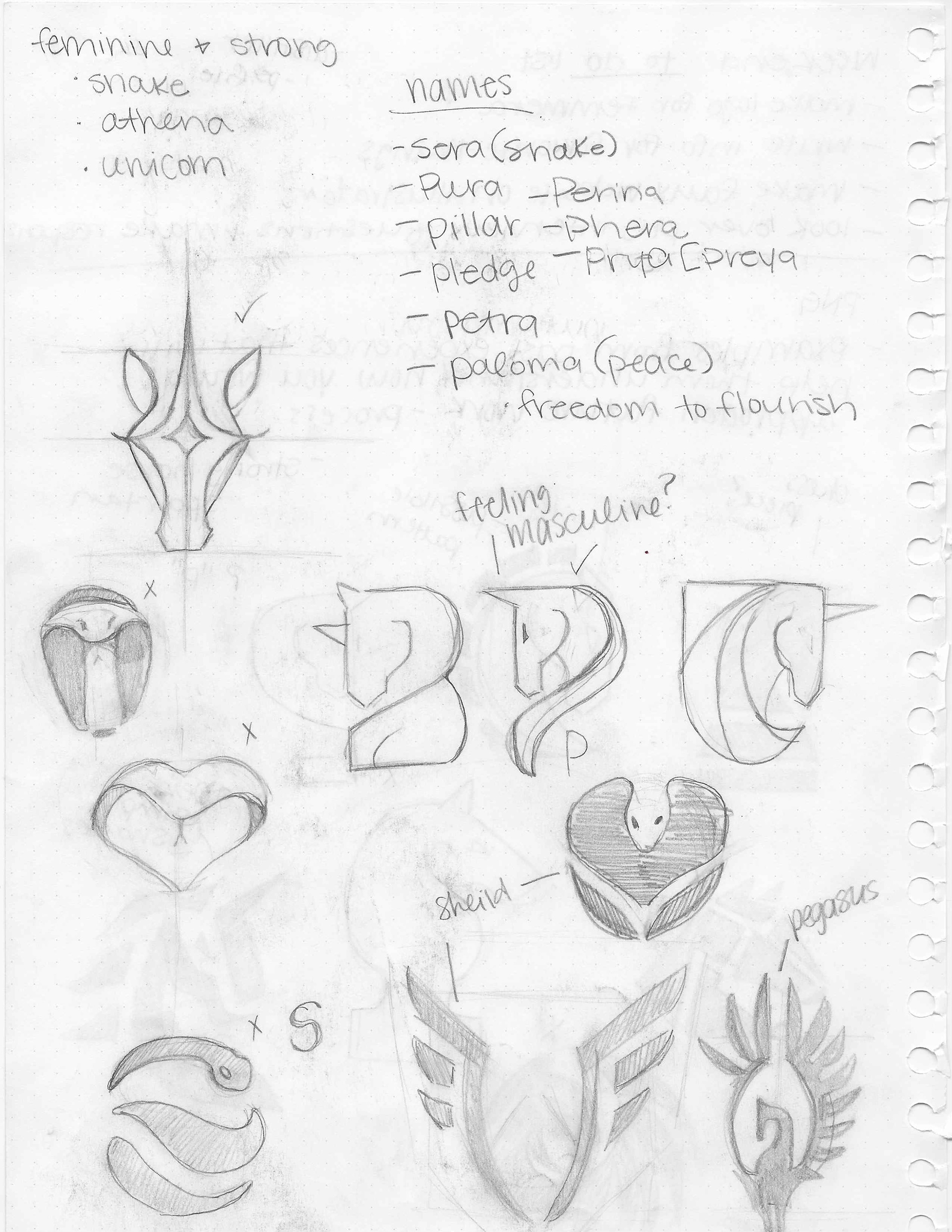
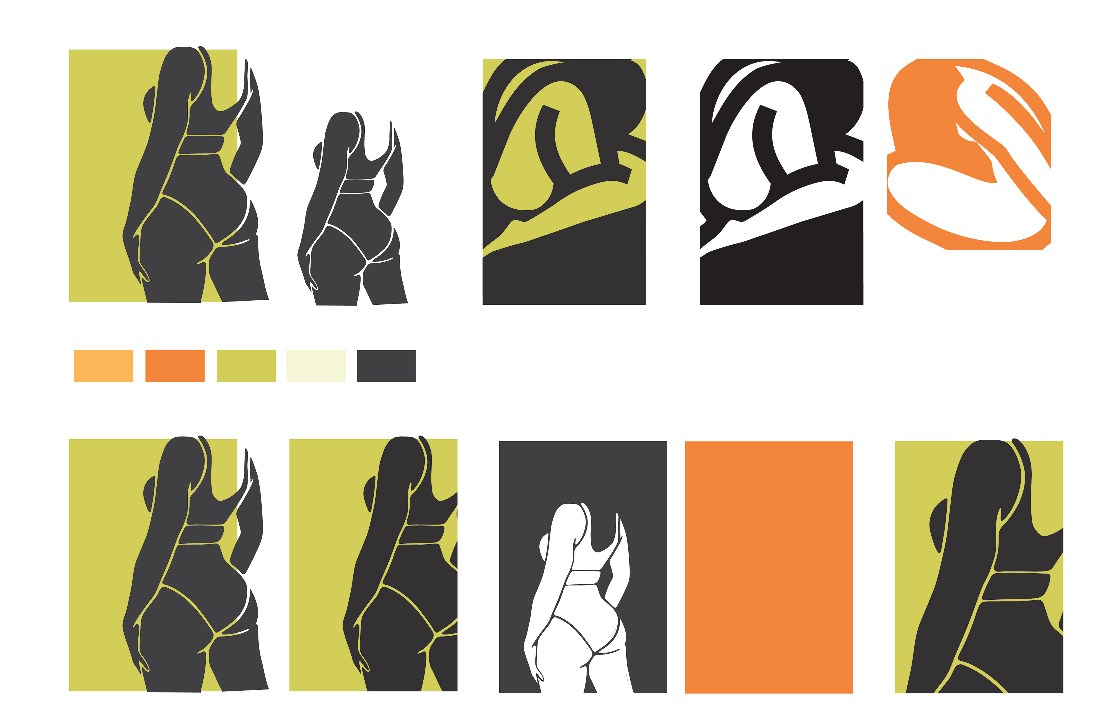
・・PROCESS WORK・・