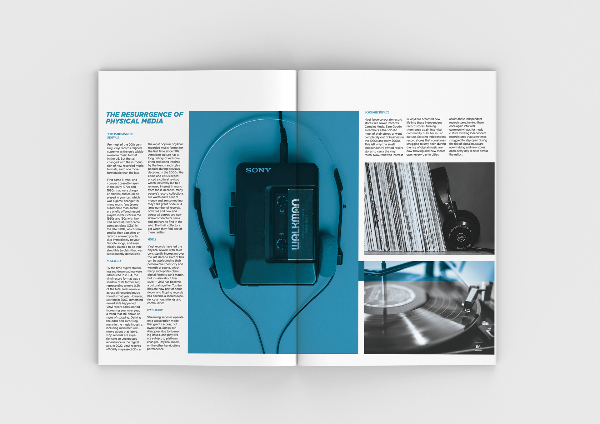

For this publication design, I was asked to create a magazine from scratch, starting with the creation of a unique masthead that sets the tone for the magazine's identity. The subject matter was open-ended, and thus, I was free to choose a subject that was close to my interests and taste. The project included the exploration of editorial structure, composition of layout, typography, and visual appearance.
The design focused on creating a modern visual identity that would remain adaptable across recurring issues. A dramatic yet minimalist masthead with a flexible grid system was the foundation of the design. The masthead for AMPED is inspired by the definition of the word amplified, to increase volume or to make something more intense. The job of the magazine is to amplify new, young artists and share their work with a large audience. The function of the magazine is to boost new, up-and-coming artists and present their art to a wider audience. High-quality photography and full-bleed images were paired with spacious white margins to balance energy with readability. Color palettes shifted slightly with each issue to keep the magazine fresh while maintaining a recognizable brand identity.
The final product is a cohesive, visually engaging magazine that merges editorial clarity with artistic flair. Amped succeeds in presenting music not just as sound, but as a cultural force, inviting readers to immerse themselves in the creative worlds of the artists it showcases.